Healio Clinical Guidance
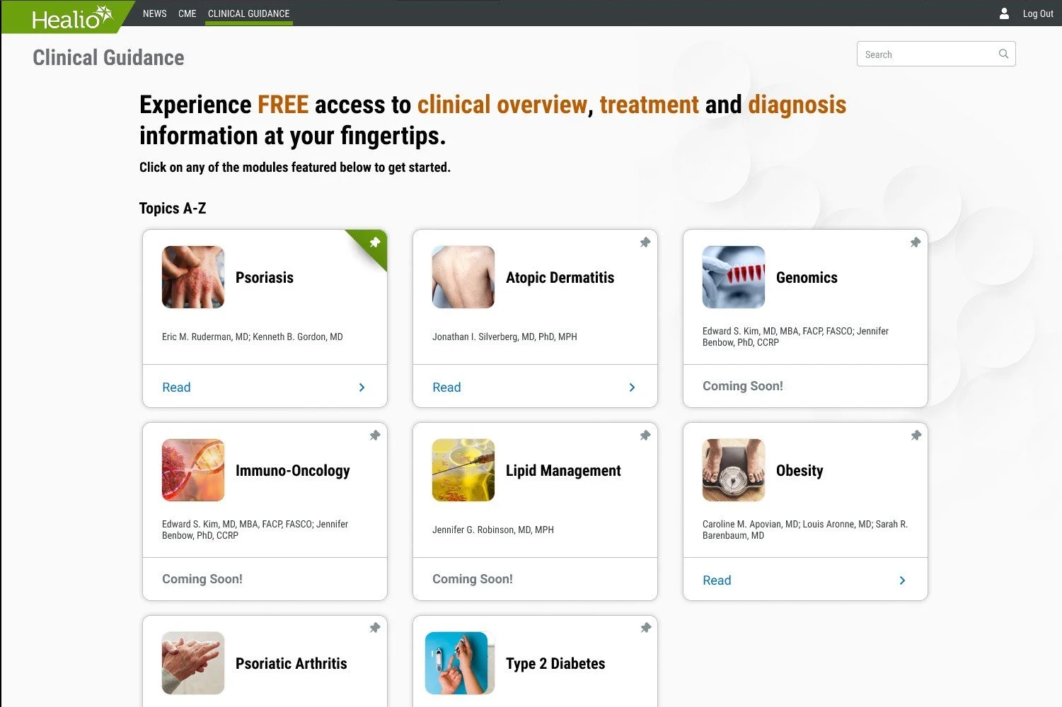
Clinical Guidance is Healio’s point-of-care tool, offering medical professionals quick access to 20 comprehensive textbooks covering a wide range of medical topics.
Challenges
Design a tool that allows healthcare professionals to quickly access relevant information during patient care.

Organize textbook content intuitively, enabling Healio’s team to efficiently add new material in the future.
Create a user-friendly tool that balances utility and enjoyment, while prioritizing ad revenue.
Goals
Make long, text-heavy content easily navigable, especially on mobile.
Design a template to handle extensive, unfamiliar content across diverse medical topics.
UX team had access to content from only 3 out of the 20 textbooks.
Balance business requirements with user needs effectively.
Initial Research
User interviews with 5 participants revealed a market need for a reliable point-of-care tool for medical professionals.
User Interviews

We analyzed competitors like Medscape and UpToDate to identify key features and set a baseline for our design. By staying true to familiar norms, we ensure our users can easily navigate the tool without reinventing the wheel
Competitor Research

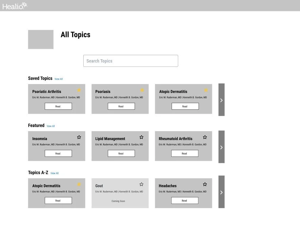
After gathering research, we began ideating features for the first design iteration, guided by insights from competitor analysis and user interviews.
Design Studio
LoFi Usability Testing
To validate our design and uncover user pain points, we conducted 10 moderated usability tests—5 for the desktop prototype and 5 for the mobile prototype, all with loyal Healio users.
Users prefer an efficient search/navigation system over browsing topics in a reference tool.
Action: Prioritize developing a streamlined navigation system.
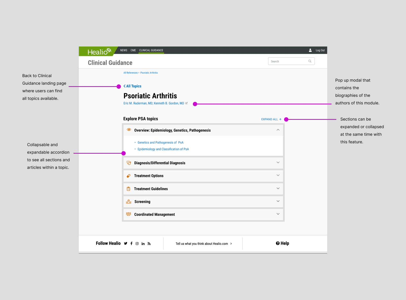
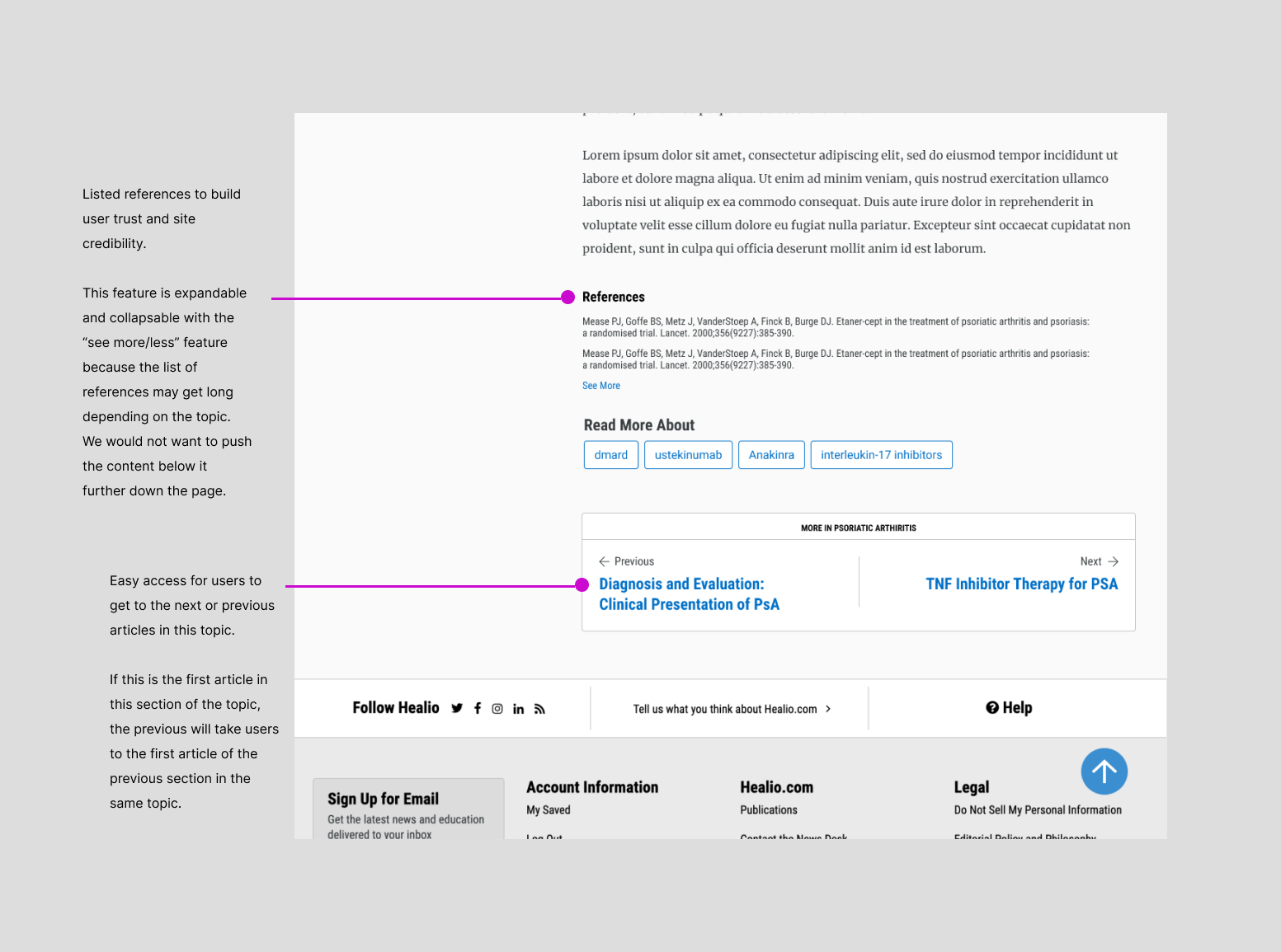
Users are cautious about online medical information and want to quickly assess a site’s credibility.
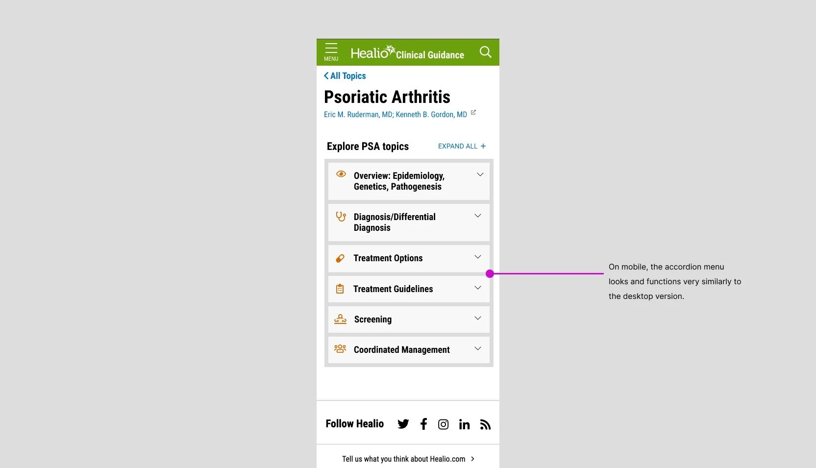
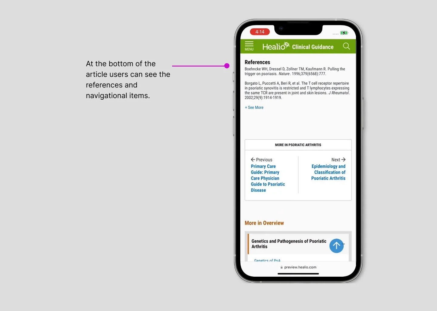
Action: Display author information for each topic and follow industry norms by placing references at the bottom of articles.
Some proposed features, like a media gallery for each medical topic, were seen as unnecessary or confusing, despite being common in competitor sites.
Action: Remove unnecessary features and refine key navigation elements.
Introducing in high fidelity
Healio Clinical Guidance
Desktop
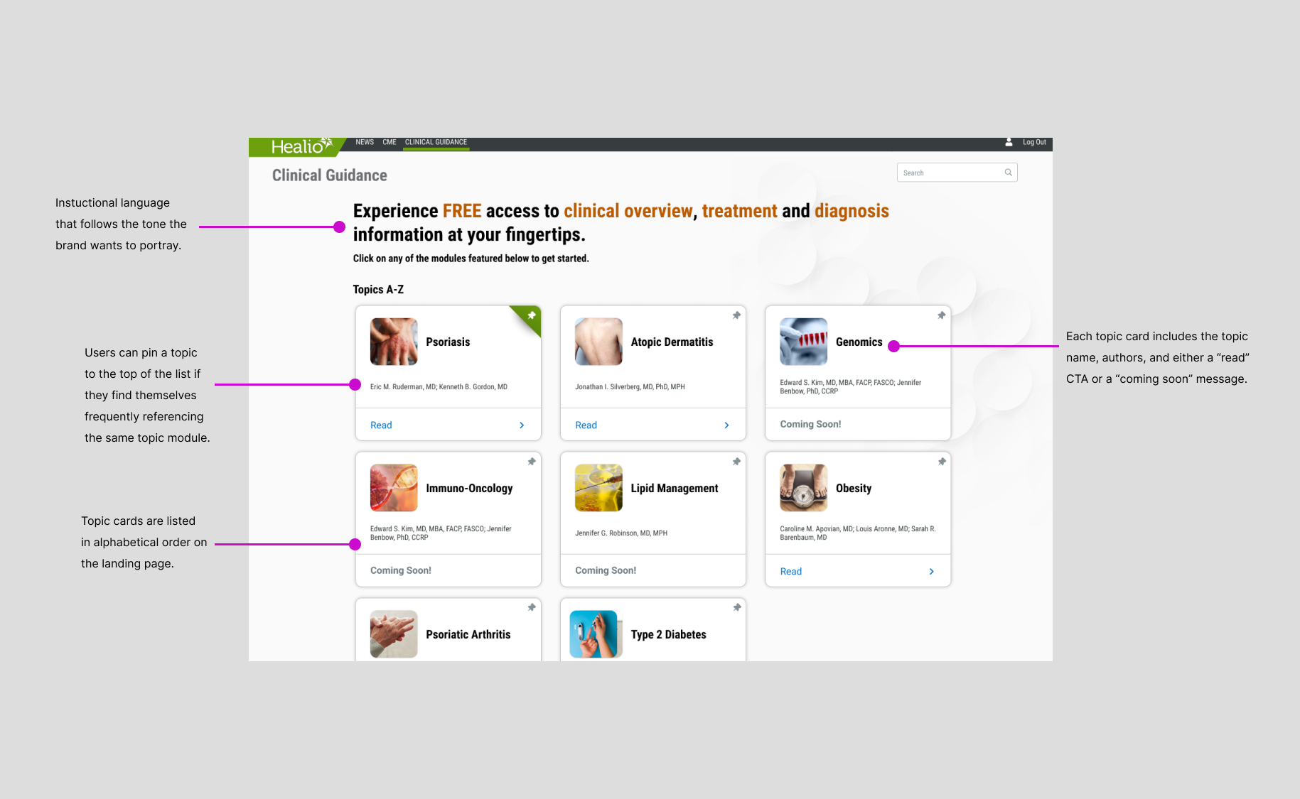
Clinical Guidance Landing Page
Topic Landing Page
Article Page
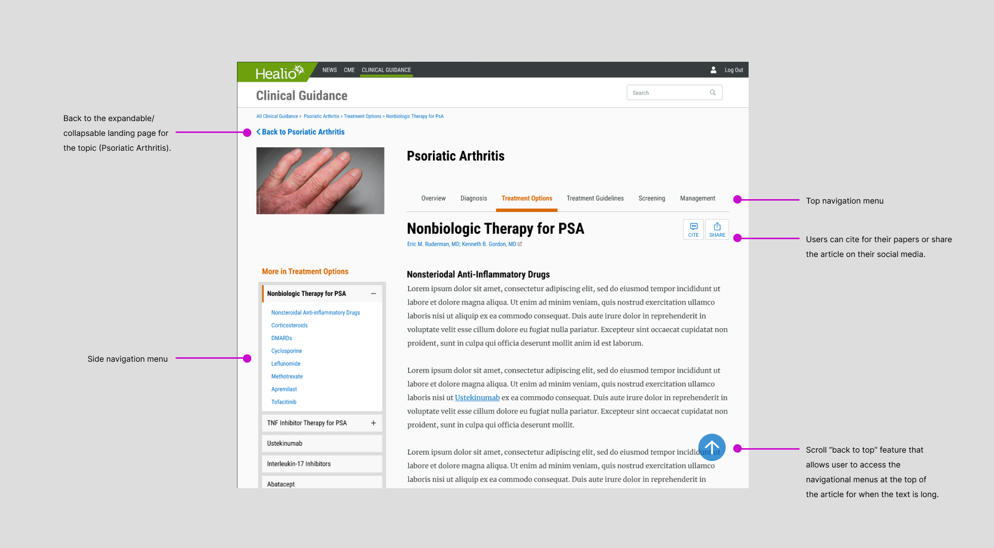
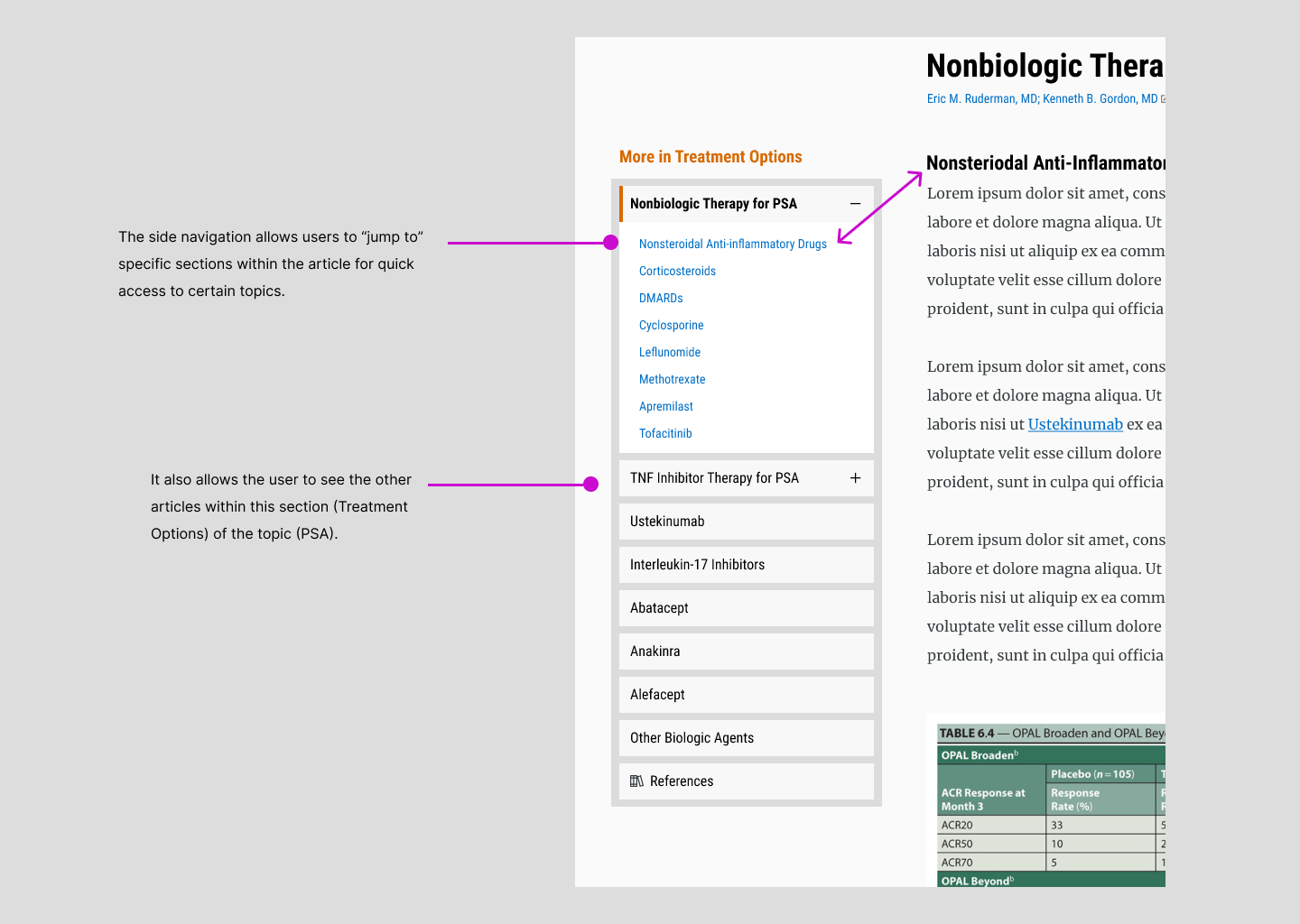
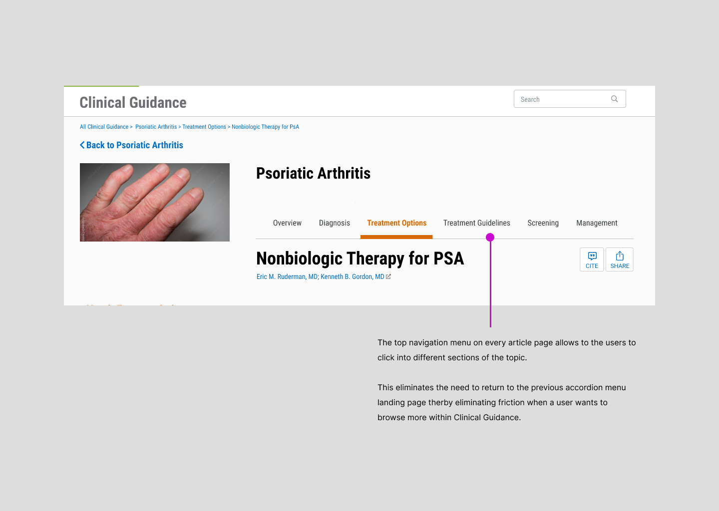
Article Page Navigation Menu
Mobile
Clinical Guidance Landing Page
Topic Landing Page
Article Page
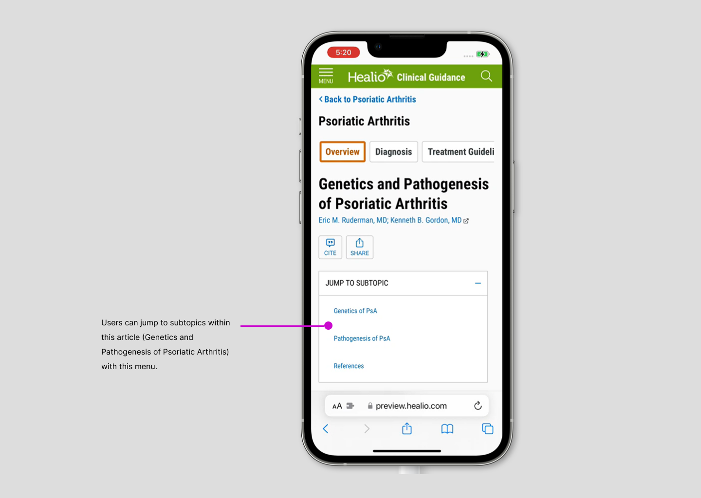
Article Page Navigation Menu
HiFi Usability Testing
To address user pain points from our lo-fi prototype, we conducted 10 moderated usability tests—5 for the desktop and 5 for the mobile prototype, all with loyal Healio users familiar with the platform.
Insights from HiFi Testing
Insight 1
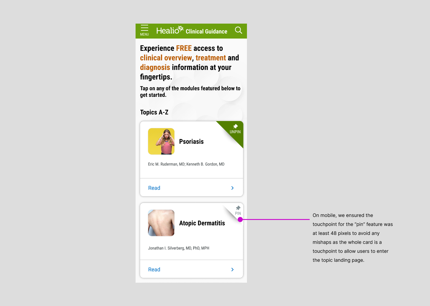
The 'Featured Topics' section on the landing page is unnecessary, as users typically have a specific topic in mind.
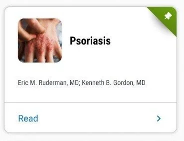
Action: Replace it with a feature allowing users to pin/unpin frequently referenced topics.
Insight 2
The side and top navigation menus on desktop provide quick navigation and an overview of the topic's content.
Insight 3
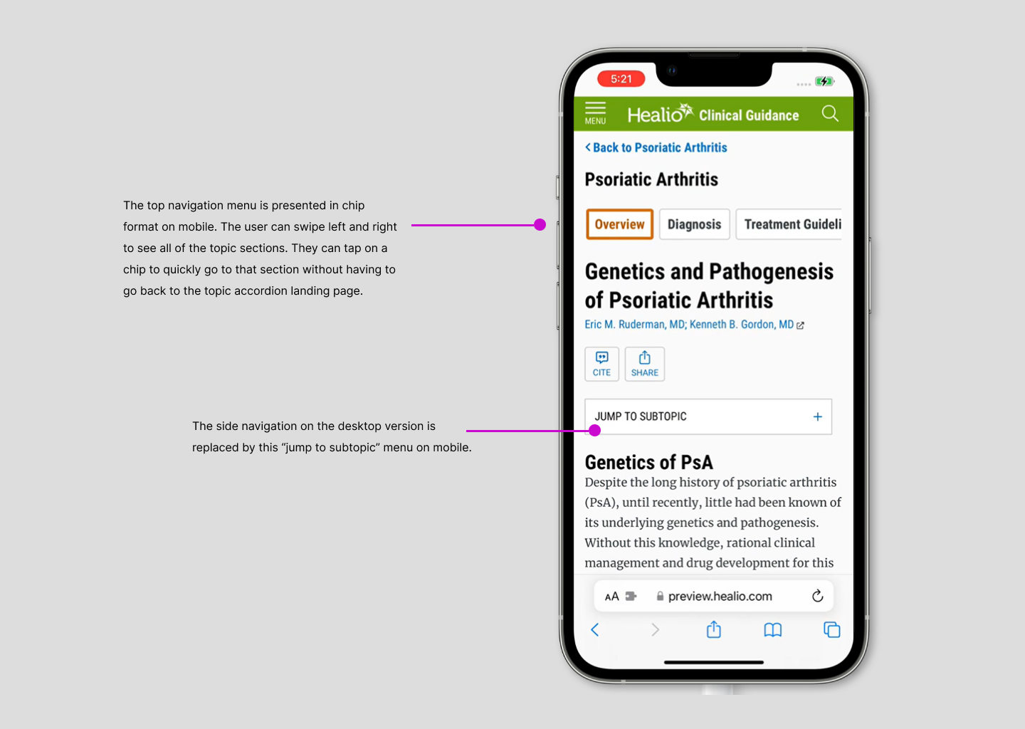
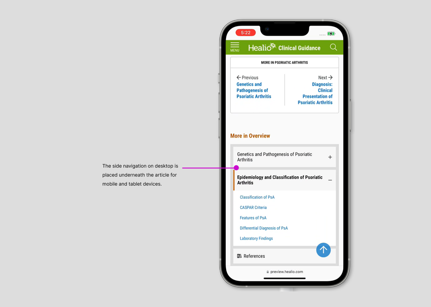
On mobile, the bottom toolbar for side navigation went unnoticed by users.
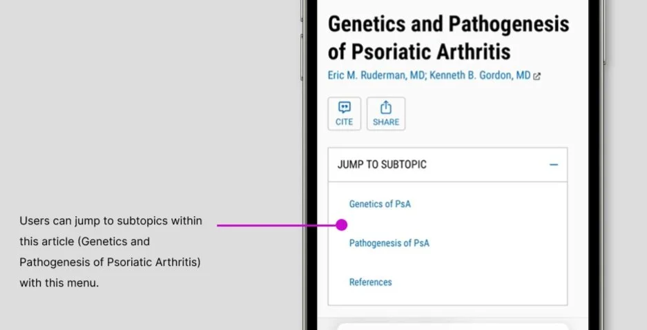
Action: Replace it with a 'jump to' menu at the top of the article to improve navigation on mobile and tablet
Collaboration
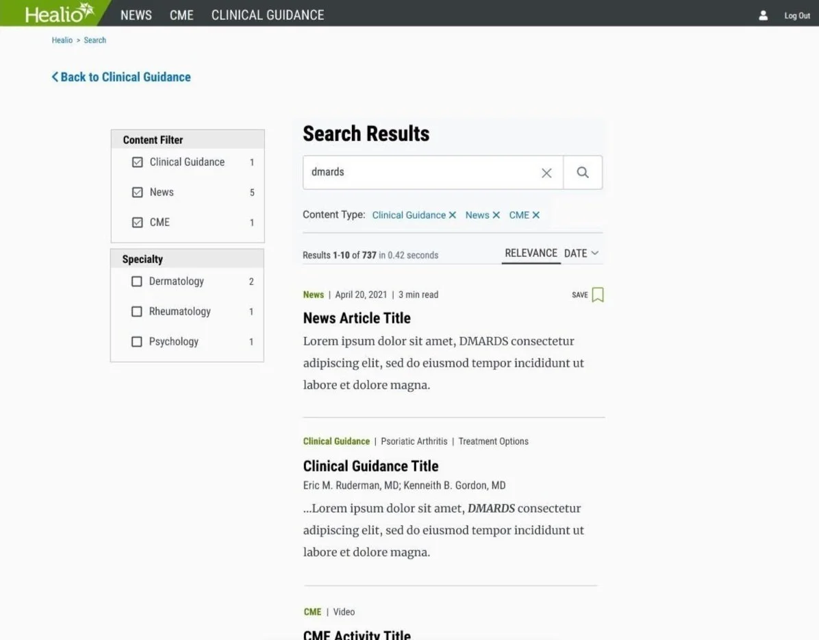
The search feature is key to enabling quick, intuitive access to vast information, so UX collaborated closely with software engineers to leverage Coveo’s capabilities. Weekly meetings helped us understand its features, and together, we selected the most intuitive options for users. Additionally, while designing the Clinical Guidance landing page, we worked with Marketing to align UX copy with Healio’s brand tone, ensuring a balance between usability and brand voice.