My Role: UX Designer & Researcher
Duration: 2 weeks
The Challenge
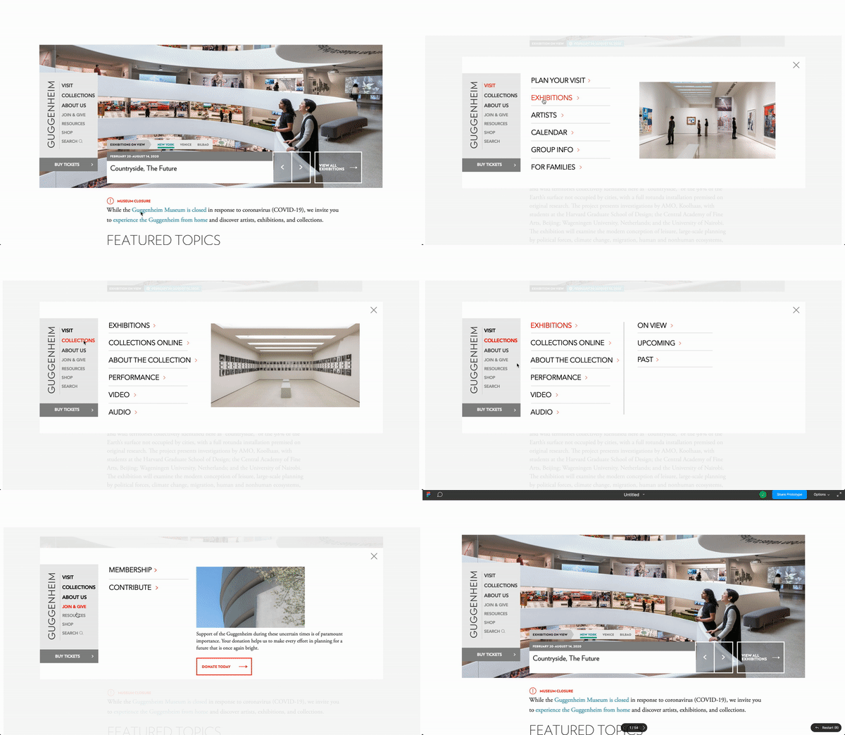
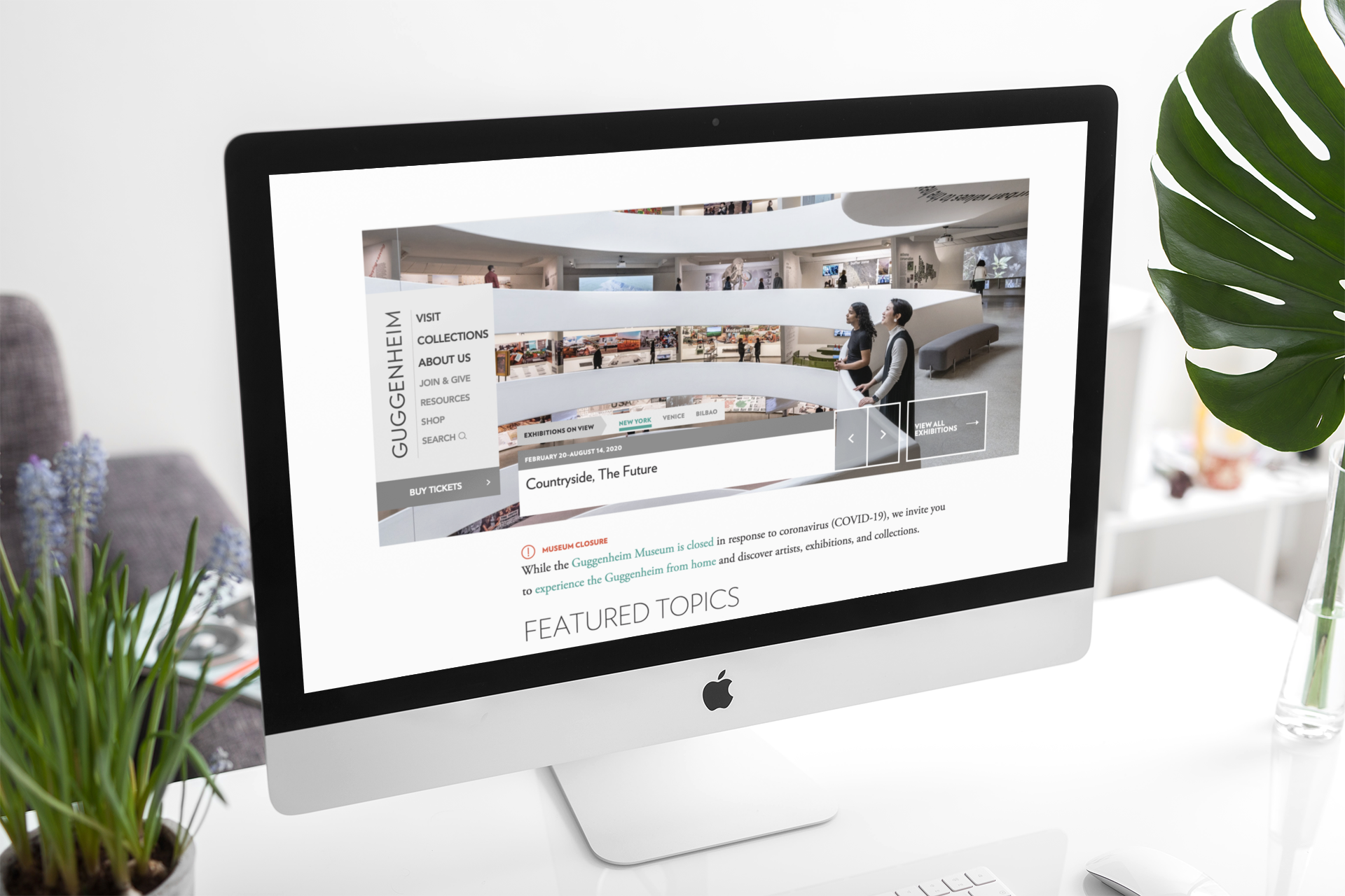
Our team was challenged with reimagining the Guggenheim Museum’s navigation menu on their website. Currently, the site’s navigation bar does not allow users to browse through the site effectively. The objective was to create an intuitive navigation bar that users can use efficiently in order to promote productive research on the site.
Business Research
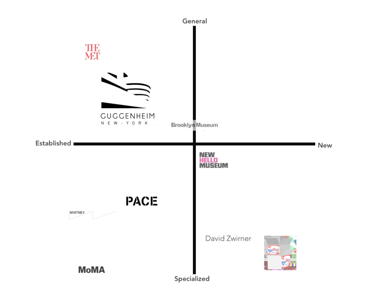
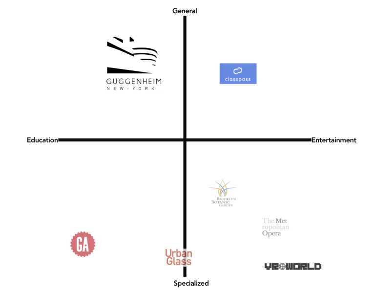
We took a look at the Guggenheim Museum’s competitors and comparators to help us identify where the museum stands in relation to the institutions that share a “space” with the Guggenheim. We also took a look at the commonalities between each site and the features that made the site unique and easy to use by conducting a feature analysis.
Competitive Matrix
Comparator Matrix
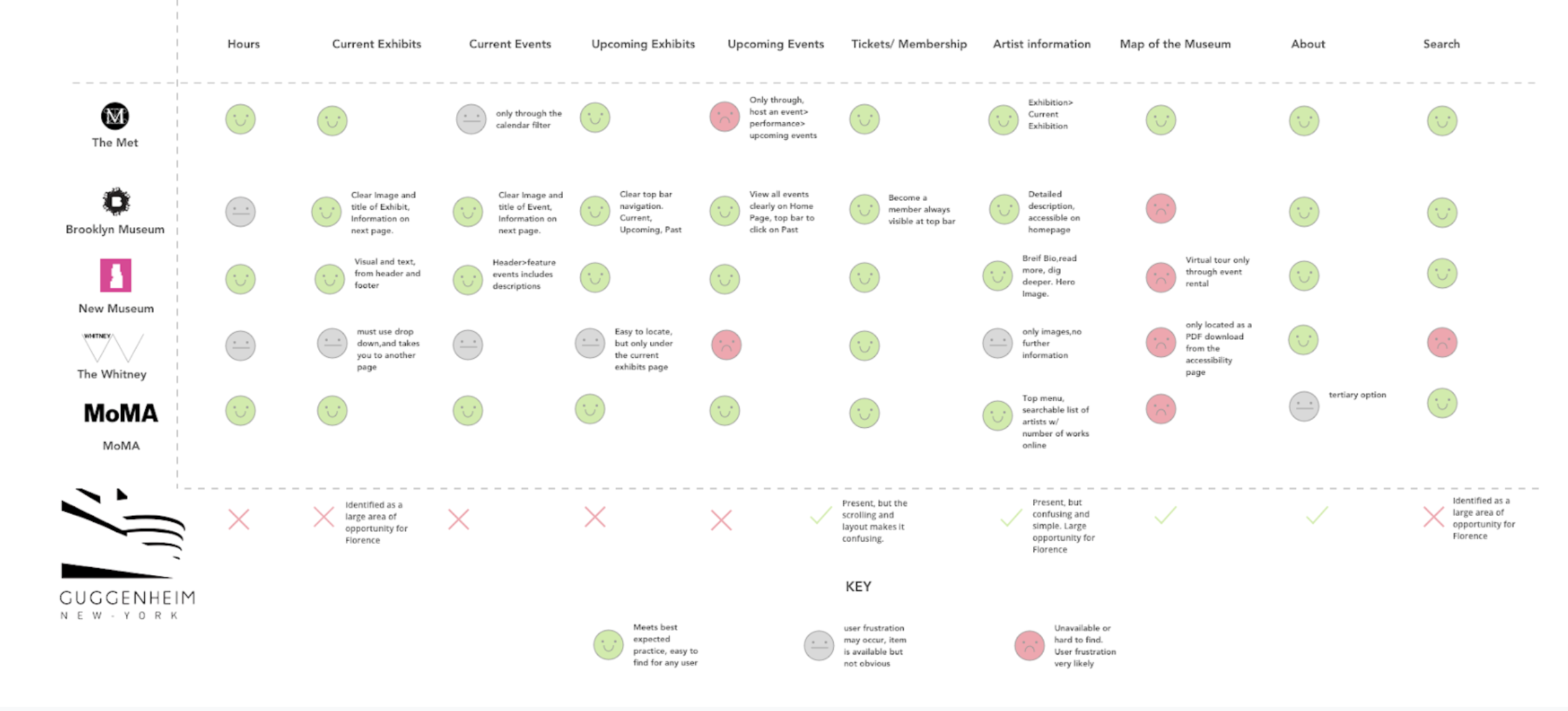
Feature Analysis
Problem Statement
How might we help museum goers find exhibition dates and artist details in a more productive manner so they can spend less time on researching and more time on planning their agenda?
Information Architecture
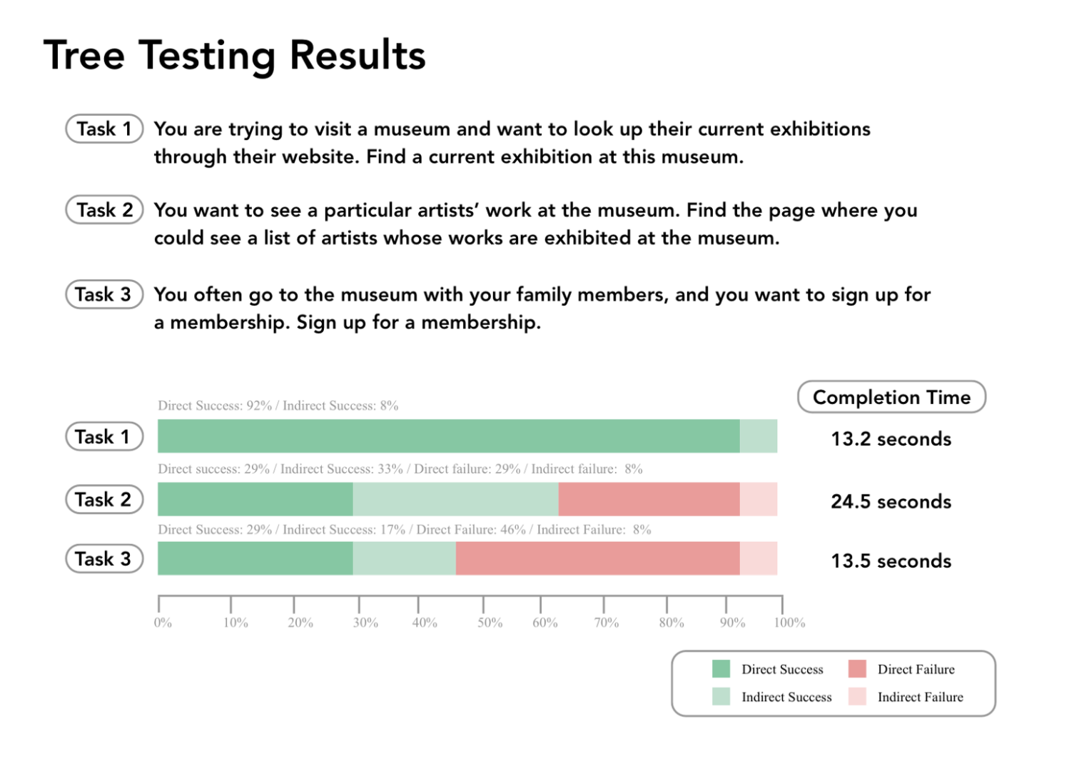
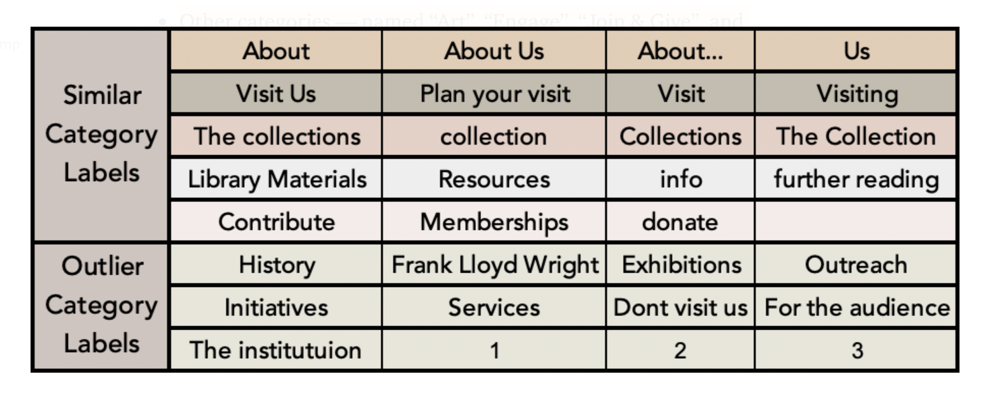
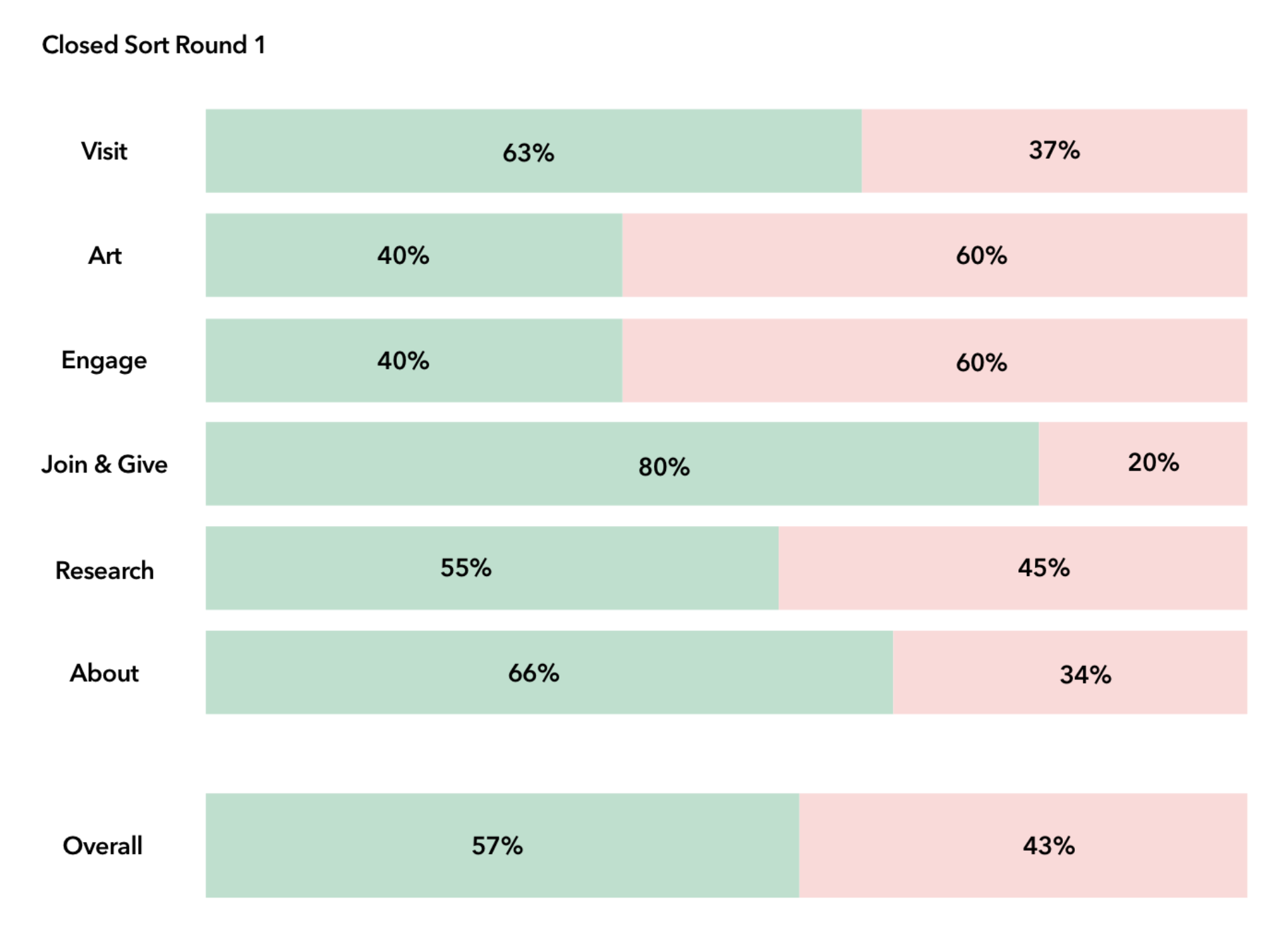
In order to fully understand how our users interact with the existing website, we conducted a round of tree testing, a round of open card sorting, and a round of closed card sorting. Once we had our hifi redesign of the navigation bar, we conducted a second round of tree testing and a second round of closed card sorting.
Key Takeaways
After conducting business research and analyzing the current site, we synthesized these key takeaways:

Users have a hard time finding artist information on the current site

Users can benefit from a clearer taxonomy and less complex path to sign up for membership.

Only 57% of the current information architecture proved to be intuitive to users.
Solution
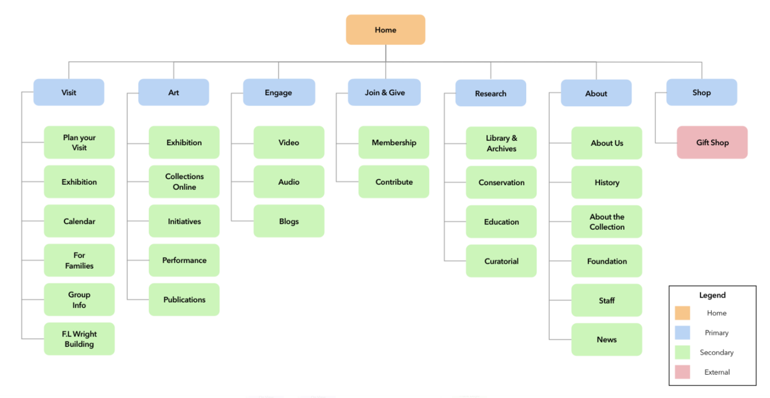
Existing Sitemap
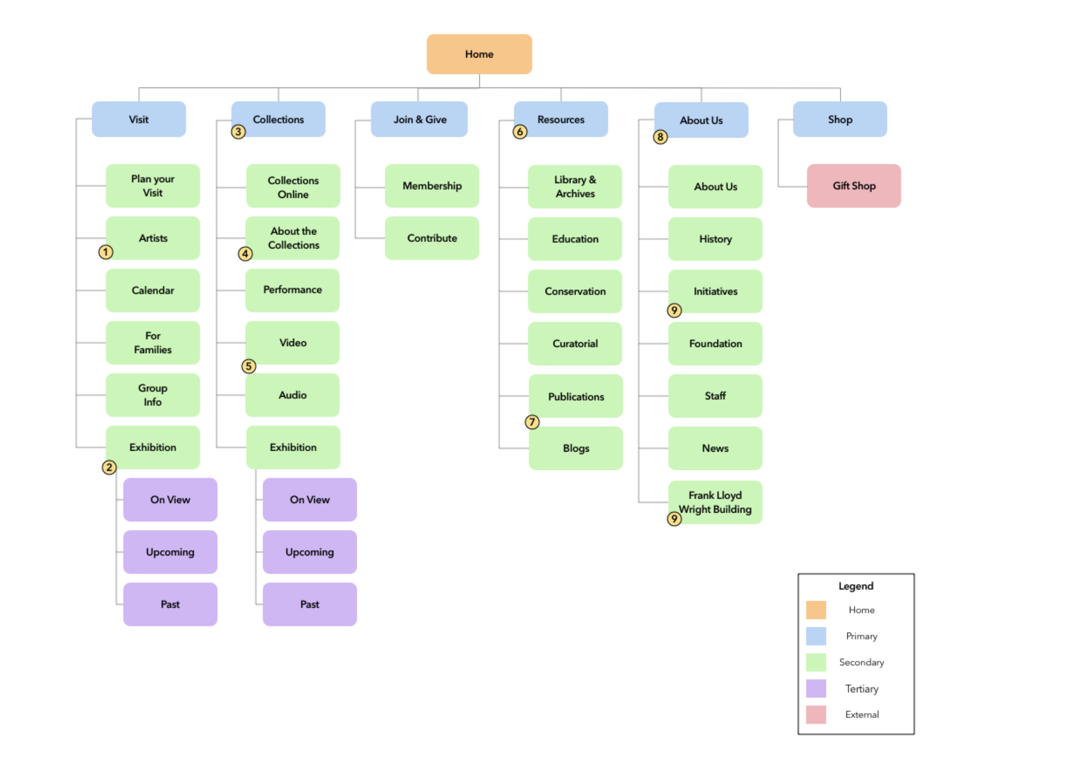
Proposed Redesigned Sitemap
The changes made to the existing navigation bar include:
Adding “Artists” as a secondary level under “Visit”
Adding a tertiary level to “Exhibitions” to include “On View”, “Upcoming” and “Past”
Renaming “Art” into “Collections”
Adding “About the Collections” to “Collections”
Adding “Video” and “Audio” to “Collections”
Renaming “Research” to “Resources”
Adding “Publications” and “Blogs” to “Resources”
Renaming “About” to “About Us”
Adding “Initiatives” and “Frank Lloyd Building” to “About Us”
Redesigned Site Test Results
Treejack Testing- Redesigned Site
90%
success rate for Task 1 during round 2. The success rate for this task slightly decreased from task 1 to 2.
50%
success rate for Task 2. Many users did not find it intuitive to look for “Artists” under “Visit”.
90%
success rate for Task 3. This was a drastic increase in success for Task 3 from round 1. Most users found it intuitive to search for “Membership” under “Join & Give” instead of “Visit”.
Closed Card Sorting- Redesigned Site
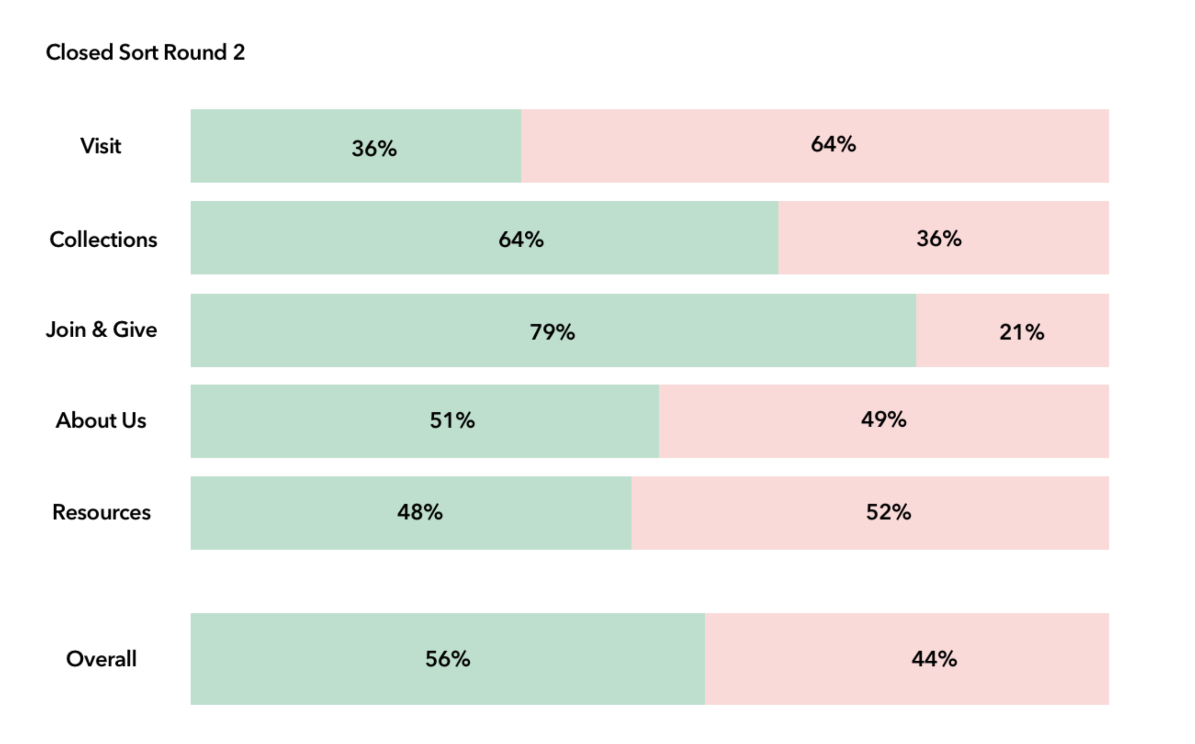
Secondary levels such as “Collections Online”, “Initiatives”, and “Education” saw an increase in accurate categorization during round two of closed card sorting.
24%
increase in accuracy by combining secondary levels formerly found in “Engage” with “Art”
71%
of participants correctly sorted it under “About Us” during round 2 with the elimination of “Art” and “Engage”. The repositioning of “Initiatives” proved successful.
Next Steps
Recategorize “Artists” under the primary level named “Collections”. During the second round of closed card sorting, 57% users sorted “Artists” into “Collections”.
Recategorize “Foundation” under “Join and Give” as 70% of users sorted the “Foundation” card under “Join and Give” instead of “About Us”.
Recategorize “News” under “Resources” as 86% of participants thought it was intuitive as our second round of closed card sorting showed.
Experiment with the visual aspect of the menu bar to promote accessibility and visual delightfulness.