CoLife
My Role: Project Manager & UX Designer
Duration: 3 weeks
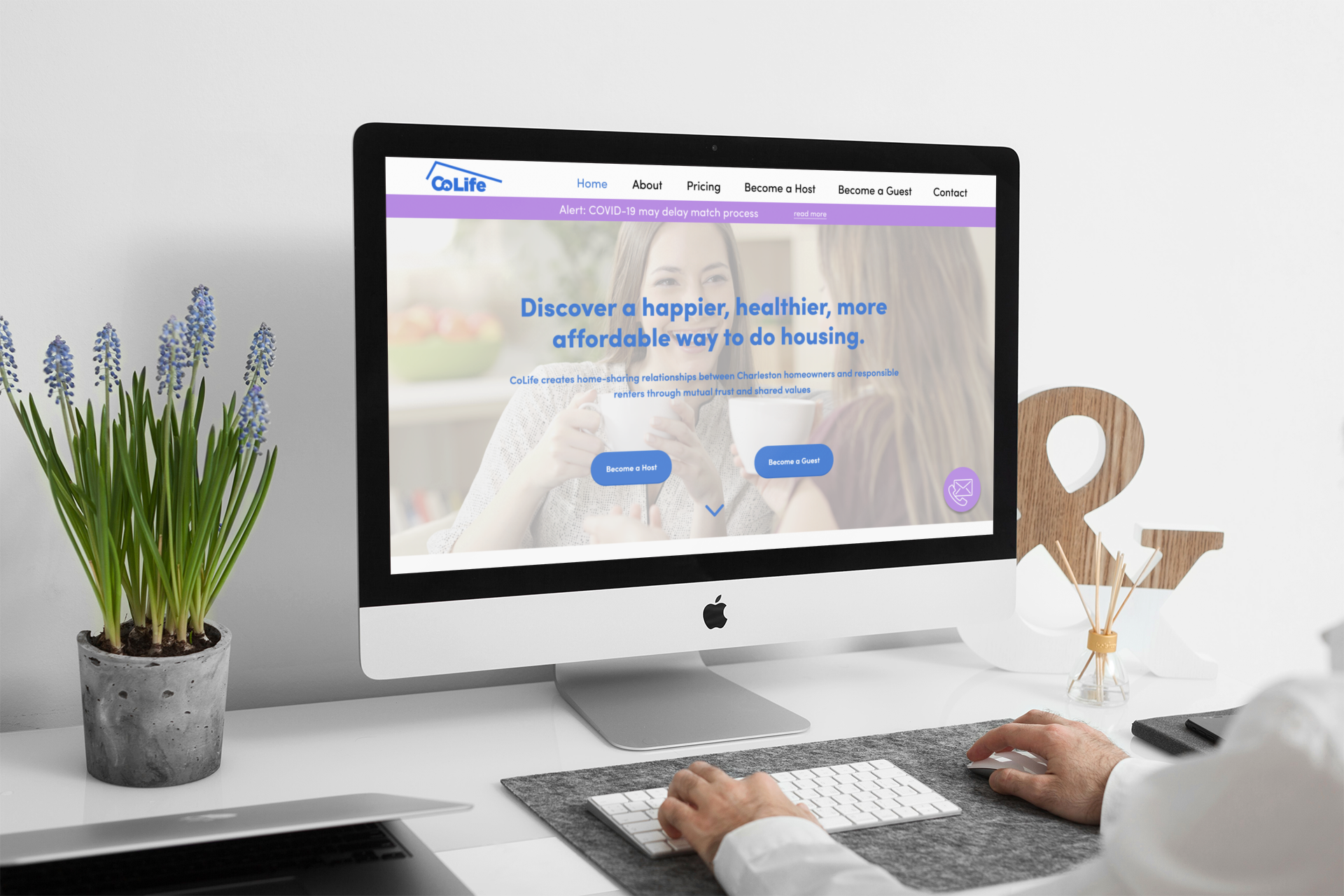
“Discover a happier, healthier, more affordable way to do housing.”
CoLife is a Charleston-based housemate matching startup that prioritizes personality compatibility over space preferences, setting it apart from traditional roommate platforms.
My Role
I worked with two UX designers to redesign CoLife's website and communication strategy, focusing on enhancing user experience and transparency.

Key Contributions:
Streamlined website tools for easier access to live support.
Revamped email content for better clarity and comprehension.
Introduced strategic texting to guide users through next steps and improve transparency.

Opportunity
Improve CoLife’s official communication to address flaws in messaging that hinder user trust and engagement.
Reduce user intimidation and skepticism by crafting clearer, more approachable communication that reassures users throughout their journey.
Increase sign-up completion rates by simplifying the process and building trust, addressing concerns that currently lead to abandonment.
Leverage CoLife’s exceptional customer support as a key differentiator, incorporating it more prominently in communications to enhance user confidence.
Outcomes
Enhance website design to showcase CoLife’s exceptional customer service, making it a standout feature that builds trust and attracts users seeking reliable support.
Strengthen trust and transparency by implementing clear, actionable messaging and proactive updates, fostering stronger connections between CoLife and its users.
Revamp email and text communications to improve clarity, engagement, and user experience, ensuring consistent and informative interactions.
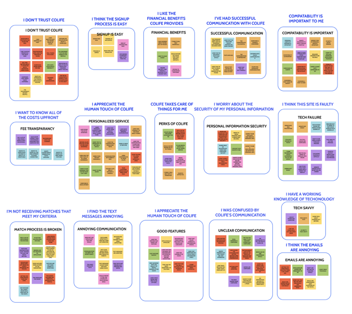
To boost user retention, we aimed to enhance email and text communications for clearer next steps. After interviewing 6 participants about their housemate-seeking experience, we created an affinity map to uncover key insights and patterns.
Research
“I would lose track where I was getting these messages from and what each one was trying to accomplish”. It keeps me from doing more in the process.”
-Jason
“I was a little confused about the process. After the initial cost of the background and credit check, what other costs are there? That’s not clear on the site.”
— Scott

Problem Statement

Users struggle to keep up with CoLife’s frequent email and text communications, leading to confusion and disengagement.
How might we streamline communication while ensuring users receive all the necessary information?


Insights
Users appreciate the human touch of CoLlie
Users are frustrated about the amount of messages they receive from CoLife
Users have a hard time trusting CoLife
Empathize
We developed primary and secondary personas from user research to guide our design strategy, addressing the unique needs, pain points, and goals of CoLife hosts and guests to enhance the user experience.

George the Guest

George, a 32-year-old nurse relocating from New York to Charleston, is looking for an affordable home in a safe neighborhood and a trustworthy guide to help him adjust to the new city.

Henrietta the Host
Henrietta, a 60-year-old Charleston native and recent divorcee, seeks extra income to enjoy her retirement and maintain her home. She’s passionate about sharing Southern hospitality with others.

Goals
We collaborated with our client to align their vision for the company with the goals of their target audience, ensuring our findings supported their strategic direction.
Easier access to CoLife support
Clear and concise communication from CoLife
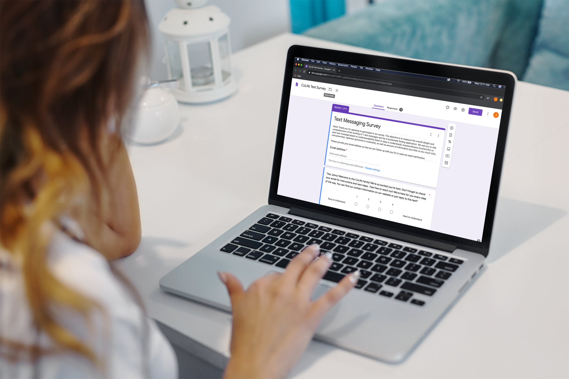
We aimed to optimize text messaging as a supplement to email communication and assess its effectiveness. Using the Likert Scale, we evaluated user perceptions across four categories:
Text Messaging Survey

Clarity (Hard vs easy to understand)
Information balance (To little vs too much info)
Tone (Personal vs corporate)
Trustworthiness (Trustworthy vs untrustworthy)

Redesigning Strategizing CoLife Communication
To address the issue of automated messages sent by CoLife, our team strategized 4 situations where using text messaging would be useful in prompting users to complete the sign up process
A “welcome to CoLife” text to direct users to their emails to check for further communication from CoLife.
A “reminder to finish the application” text to the user did not complete the process.
A “reminder to finish background check” text if the user did not finish the background check.
A “you’ve got matches!” text if the user was matched
Solution
The 'What to Expect' section enhances transparency by clearly outlining the next steps in the process, providing users with an organized overview before completing the sign-up form.
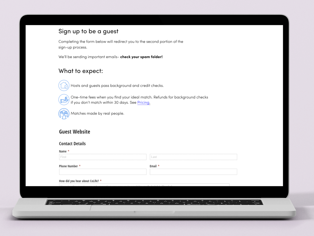
“Become a Guest/Host” Form Redesign
The butter bar keeps users updated on current events, while a floating contact bubble provides easy access to CoLife’s support team. The 'Recent Stories' section builds trust with new users by highlighting positive experiences, reflecting feedback that many users value speaking with customer service."
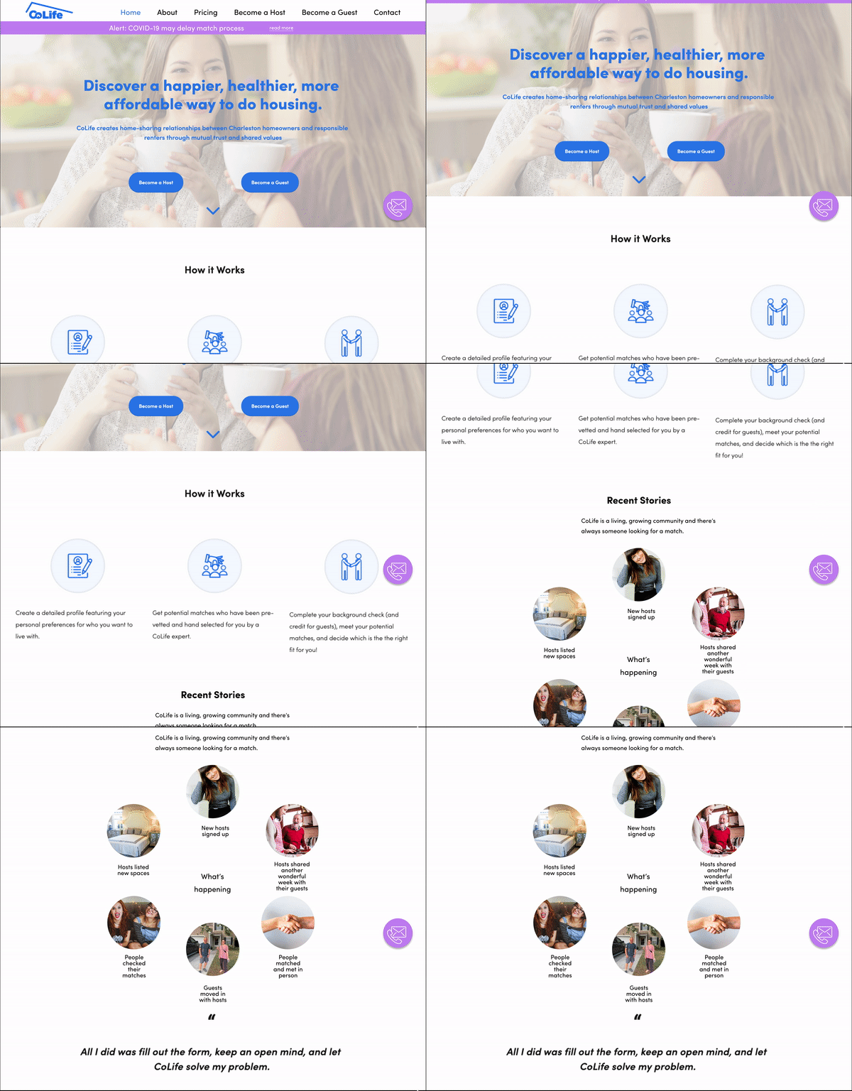
Homepage Redesign
We redesigned CoLife’s welcome email for clarity, using icons and clear steps, while highlighting key details like the refund policy, background check info, and support contact.
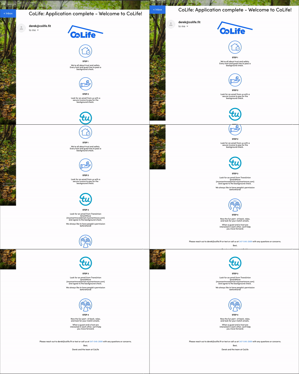
“Welcome Email” Revision
We replaced CoLife’s lengthy text notifications with a brief welcome message after users submit their application, directing them to their email for official communication and next steps."
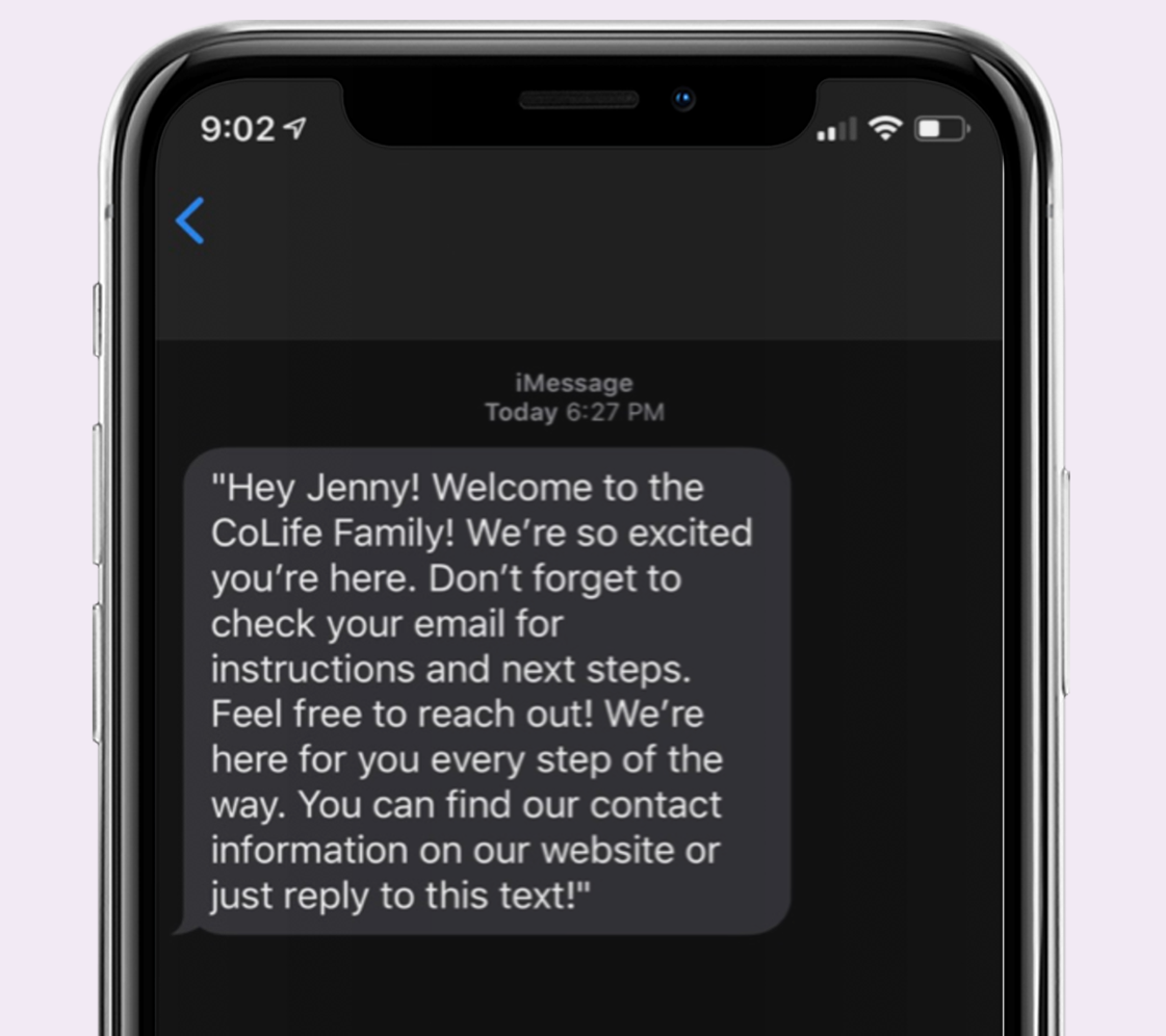
“Welcome” Text Revision
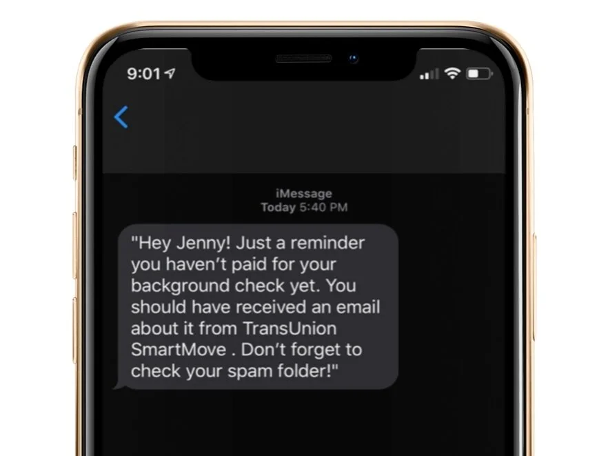
The revised 'background check reminder' text is more concise and includes key details, like the heads-up that the email will come from SmartMove.
“Background Check Reminder” Text
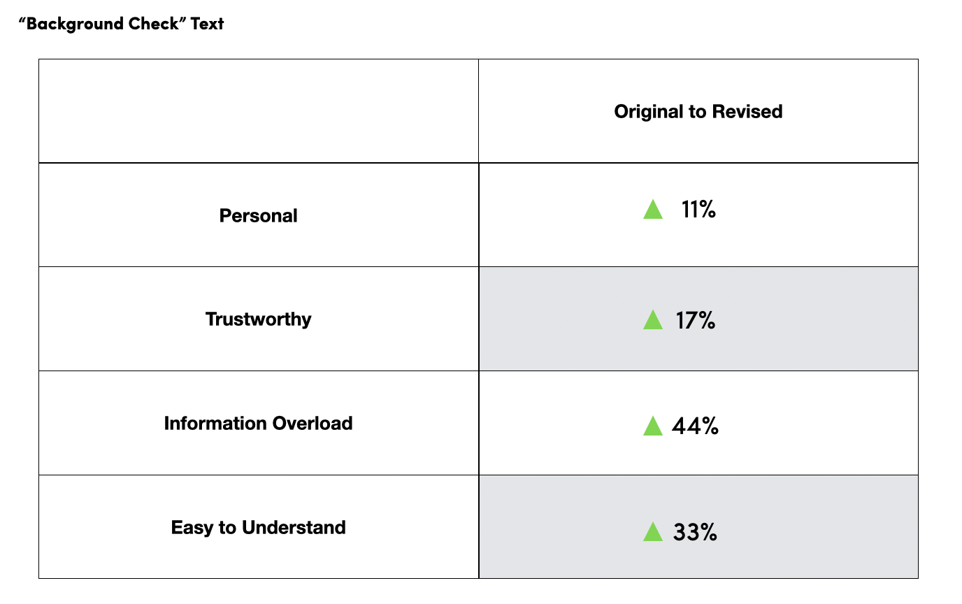
Similarly to the “finish application" reminder text, the revised text messages showed improvement in all four categories.
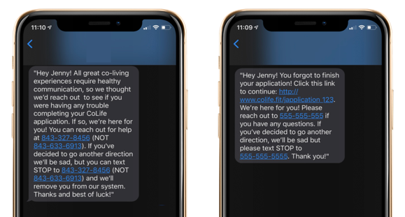
We simplified the 'incomplete application' text by adding a direct link to the form and removing extra support numbers to reduce confusion. The revised message is clear and concise, making it easier for users to continue their application.
“Incomplete Application” Text Message Revision
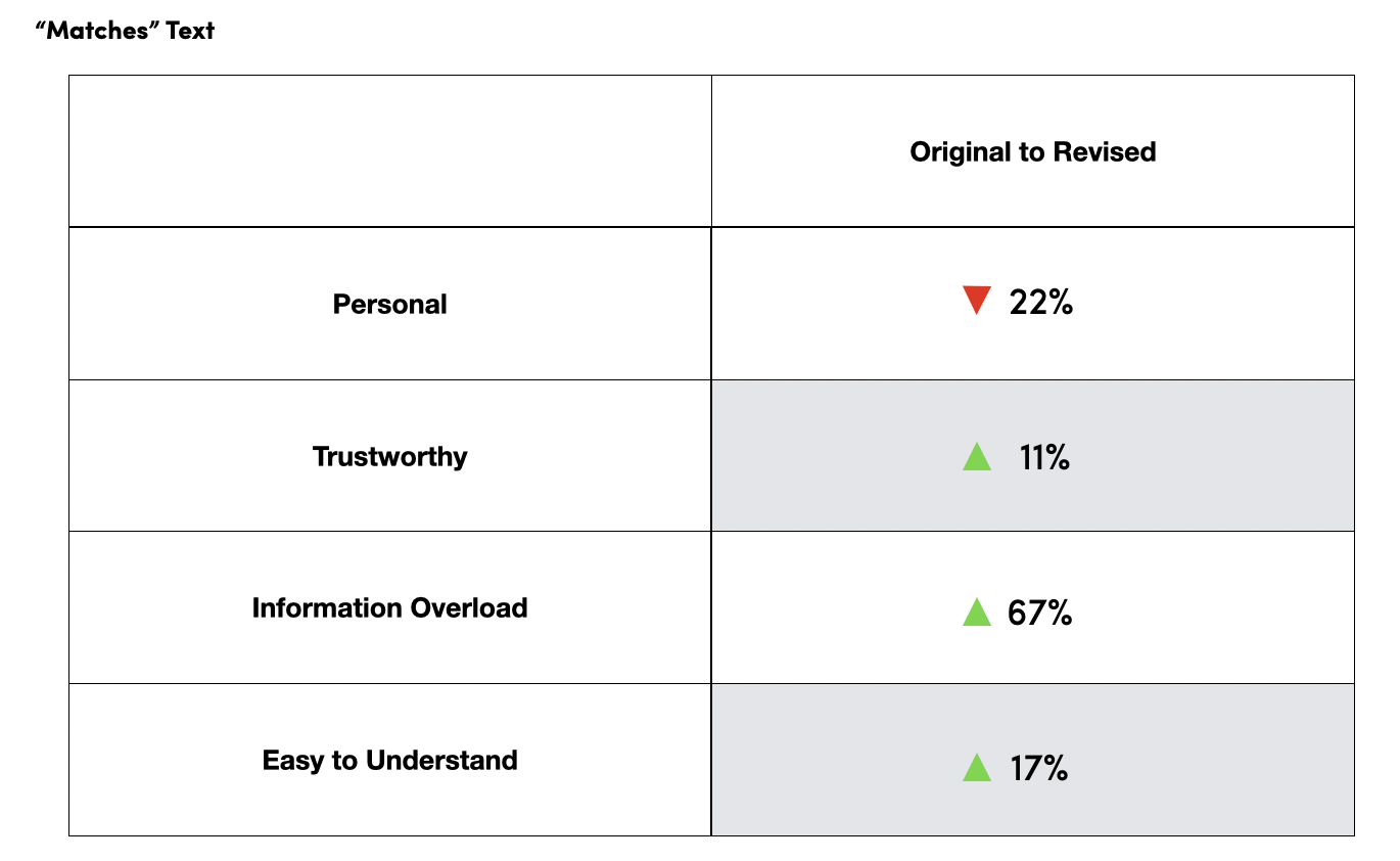
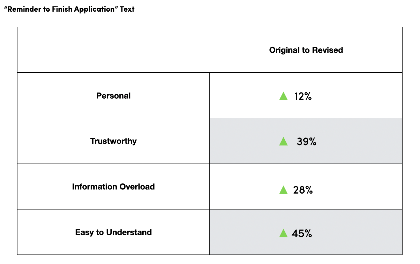
Both original and revised text messages were evaluated across four Likert Scale categories. The revised messages showed improvement in all areas, with 45% of users finding them easier to understand.
The original 'check your matches' text included a confusing extra support number and lacked a link to the match portal, creating friction for users. The revised text is clearer, with a simple prompt and a direct link to the user's match page.
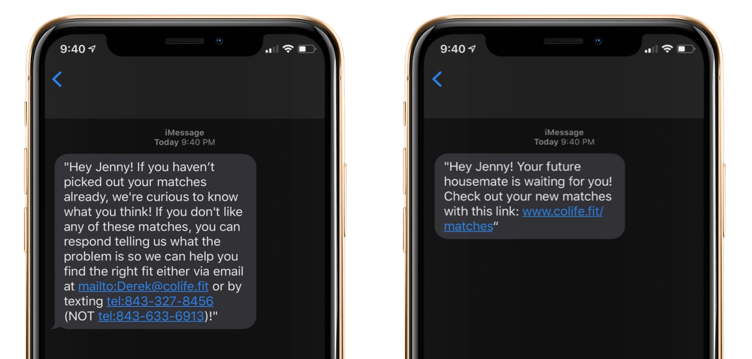
“You’ve got a match” Text
While the revised texts showed a slight decrease in the personal vs. corporate category, they improved in the other three areas.